Monday, December 7, 2015

Fashion

1st video-
The model's neck was stretched slightly up and her eyes were made lower and bigger.  A little more shadows were added around the outline of her face as well.

2nd video-
The model's legs were made slimmer and longer, her neck became slightly longer too.  Her shoulder was lifted a little bit and highlights were thrown everywhere.

3rd video-
The girl's body was shrunk down by quite a bit to make her slimmer, then her head became a little smaller to match the new body size.  Her hair was made longer and more crazy.

Questions-
4. In news stories and big events people don't use Photoshop to change those photos drastically before putting them on the news.  That wouldn't be ethically acceptable, so I don't think changing someones appearance and putting it on ads everywhere is either.

5. I think during ads for beauty products like makeup is one of the times when it's even worse to change someone's appearance.  When you see a commercial for makeup you want to see what it actually looks like on a normal person, not what it looks like on the face of a nonexistent woman with  unreachable beauty.

6. Some changes are acceptable, maybe there is a person who wants to use a girl for a ad or something.  She has the exact shape they are looking for but she has a birthmark on her upper stomach.  There is an acceptable time for Photoshop, however, it isn't so good when they change her skin tone, and make her legs longer,etc.

7. Fashion photography is a more persuasive use of the camera and requires a lot less camera and more computer, photojournalism can still be used for persuasion to go somewhere and such but it is also used for things like the newspaper and is mostly camera not computer.

8. Fashion photography shows very little truth or reality.  It's used mostly for ads that just want you to buy the product.  Photojournalism can be similar in ads advertising for a place but that isn't all it is.

9. I think you are showing us these videos so we can see other parts of photography and possibly get frustrated enough with it to try to do something about it.

10. The videos most likely don't have guys because the perfect physical appearance for most boys is easier to get too than the perfect physical appearance for most girls.  Also with marketing more beauty products are for woman than for men so more woman are used for ads like that.

Tuesday, December 1, 2015

My Favorite Cover


Favorite


Wired, September 2014, Edward Snowden"Edward Snowden didn't want to be photographed. He wanted his actions--leaking classified NSA files--to be the focus of any story, not his face. But. But. Being shot by Platon, who has photographed world leaders like Dick Cheney, George Bush (both of them), and Vladimir Putin, puts him on the same level as those subjects, elevating his message. So out of complicated motivations comes a tense and compelling photograph. As Snowden holds the flag, his face and his hands convey both respect and hurt--a flickering combination of protectiveness and vulnerability. Words would tip the reader toward a single interpretation. So. No design. No cover lines. Just an image, however you choose to look at it."

The image above has great lighting that focuses right on the focal point of the photo, the man's face.  The flag he is holding is positioned in such a way that it leads your eyes up to the focal point.  The expression shown is well suited for the circle of light illuminating it.  The lighting towards the edges of the cover however, make his arms and parts of the flag appear grainy.  To fix this, they could have possibly done rings of light rather than just one circle.  The rings of light would not only help the graininess but would also add on to the mood in my opinion.

Best Covers

1. Formal
2. Formal
3. Informal
4. Formal
5. Formal
6. Formal
7. Formal
8. Formal
9. Environmental
10. Formal
11. Formal
12. Formal
13. Formal
14. Informal
15. Formal
16. Formal
17. Formal
18. Formal

Monday, November 30, 2015

Magazine Tips

1. Who am I trying to appeal to?
2. Make sure there is enough information so the reader knows what the magazine is about.
3. Make sure the information is understandable and quick to read.
4. Try to make the cover stand out from the rest.
5. Make the cover grasp the reader's attention, interest them.

Prompt Shoot

Purple

Cold

Electric

Monday, November 16, 2015

Self Portrait and Portraits PART 1

"Framing is a technique where by you draw attention to one element of an image by framing it with another element of the image."

"The settings in which you make pictures of people are important because they add to the viewer's understanding of your subject. The room in which a person lives or works, their house, the city street they walk, the place in which they seek relaxation—whatever it is, the setting provides information about people and tells us something about their lives. Seek balance between subject and environment. Include enough of the setting to aid your image, but not so much that the subject is lost in it."

"Wherever you are with your camera, always be on the lookout for those moments when a person's character shines though. If you have a formal portrait session with someone, make some frames of him while he straightens his tie or while she brushes her hair before the formal sitting. Walk back to the car with her and shoot her on the street. If you are on a spring picnic with the family, look for that moment of bliss when your wife leans back, sated, to enjoy the caress of the warm sun. If you're on the street, look for the impatient expression on a pedestrian's face as he waits for the light to change. Always be on the lookout for the telling moment. Every person has a story, and every picture should tell part of that story."

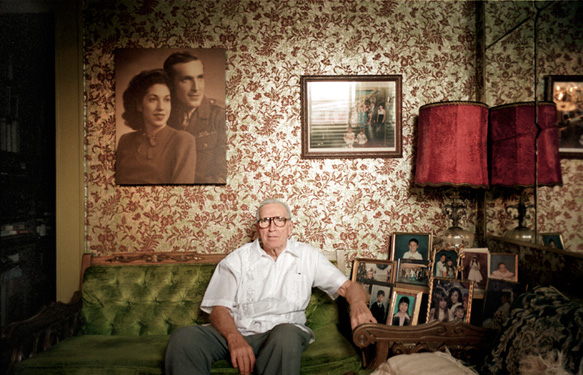
I liked this photo because the environment around the man seemed to be an extension of his personality.
 Image result for environmental portrait
I liked this photo because the background adds on to the photo instead of distracting viewers.

Image result for photography self portrait
I liked this photo because it seems slightly mysterious while also showing one defined emotion.
Image result for photography self portrait
I liked this photo because even though you see the camera and can know it is a photo, it still seems like your standing right in front of him.
Image result for casual portrait
I liked this photo because the child is so relaxed and couldn't care less about the camera.
Image result for casual portrait
I liked this photo because it displays so much emotion.

Love and Loss

1. As I started with the first image I felt happy, however, as I continued down it became much sadder and a growing sensation of fear occurred.  I began to worry for what would happen in the end. 

2. The comment is very true, these pictures are of them and things they have done and experienced, however, this is not everything that they have done and experienced.

3. I'm not sure, most likely I could do some and not others.  If an image was too sad for me to take than obviously I wouldn't take it, but if the image caused some emotion then I probably could.

4. If I were to write Angelo a letter I would thank him for taking these photos and showing their journey.  I would write about how powerful the images are by themselves and how they become even more amazing together.  Lastly, I'd state that I was very sorry that he and his wife had to go through all of that.

Monday, November 9, 2015

American Soldier - Photos Make the Story

a. The 2nd photo I thought was the most powerful.  It showed a drastic change in this person's life, even without background knowledge you can tell that he is concerned and doesn't know what's going to happen.

b. Set 1- At Home- Image 1 to image 4
Set 2- Basic Training- Image 5 to image 15
Set 3- In Iraq- Image 16 to image 27

c. I think the most powerful set of images was Set 2.  It displayed emotion in each photo, you could tell he was scared, and towards the beginning, lonely in each of the photos.

d. The images show you how parts of his life where he becomes scared and confused to where he becomes stronger and confident. 

e. Present Tense

f. It enhances the photos by giving just enough information for you to get an idea of what's going on and understand or connect more with the photo.

g. Ian Fisher had to prepare to leave his family and friends to go to basic training for the army.  As he arrives at basic training he hurts his back, foot, and then his ankle which results to him taking medication.  He goes off to Iraq and works as a quick-reaction force member for a while and helps in some other ways as well.

Tuesday, November 3, 2015

Rule of Photography Part 2

Image result for dog photos
Rule of Thirds
 
Image result for dog photos
Balancing Elements
Leading Lines
 
Image result for dog photos symmetry
Symmetry
 
Image result for dog photos
Viewpoint
 
 
Image result for dog photos
Background
 
Create Depth
 
 
Image result for dog in tunnel photos
Framing
 
Image result for dog photos
Cropping
Image result for dog perspective illusion
Merger
 

Sunday, November 1, 2015

Africa and Abandoned Theme Parks

Africa

1. The photos of the animals were stunning.  They conveyed so much emotion without color or facial expressions.  Nick Brandt is an amazing photographer and person, showing people the beauty that is disappearing due to us.


I liked this photo because of the interesting setup, he could of taken the photo at another angle to make it obvious that there are two separate lions next to each other.  Though he instead took a more risky angle of a nearly straight on.  I like this angle more than what I think other angles would look like.
Rules:
Rule of Thirds; the subject (the lion who is sitting closest to the camera's face) is not centered nor off at the edge.
Nick Brandt uses a Pentax 67II with two fixed lenses, this is because he wanted to use film instead of digital and he liked the waist level viewfinder.
He took these photos because he wanted to express his love for East Africa and the animals in it. 
He wanted to raise awareness for the dying animals of East Africa.
"There is something profoundly iconic, mythological even, about the animals of East and southern Africa."
Theme Park

Glen Echo Amusement Park in Maryland looks like a good place to take photos.  I think this place would be good because it looks like it has some cool things t use as the subject for the photos.  I like how it's abandoned but it doesn't give me the same creepy feel as the other locations. 


  • Candy shop
  • Art supply store
  • Bowling Alley
  • Hospital
  • Junkyard


A candy shop is a bright, colorful place.  It would be good for happy, energetic feeling photos.  I think the many shapes, colors, sizes would be great for variety in the photos.

At this location not much in terms of equipment is needed, a tripod and a camera and you can take some photos.  I don't think you'd have to worry about laws as long as you actually have permission to shoot in the store. Not much money is needed for this, unless you have a sweet tooth. 


Tuesday, October 27, 2015

Funny Captions


Jerry, a retired tattoo artist, claims, "I believe tattoos are a good look for everyone."
However, after posting this picture many people who might have agreed no longer do.


Deb turned 91 today and she was extremely excited to receive an exercise video.
It was given as a joke, but Deb was sure they were wrong.


John is seen here on vacation with some monkeys he found while his family went to the bathroom.
His family returned to discover that John was convinced he was lord monkey and had to stay with his subjects.


Sunday, October 25, 2015

Great Black and White Photographers PART 3

I liked Arnold Newman's work because it conveys a lot of emotion in an everyday scene.  The first thing I notice in these photos is how balanced they feel.


I see two men who work hard everyday to afford the necessities of life.  Two men who used to dream big and imagine a perfect life.  Two men who give it their all and never receive the equivalent.
I smell the mold on the rotting wood of their chairs.  The stench of two unbathed men and a dog.  Then there's the smell of the bland mush that appears often as their meal.
I hear the whimpers of the dog, begging for food.  There is also the creak of the chairs as the men try to get comfortable.  Then there's the slow steady rustle of leafs from the worn trees and wind.
I feel sorry for the men in front of me.  They have had to go through hard times.  These men have stood strong all their lives.


I see an old home and a clothes line.  Two things that have seen families come and go.  I see the wear and tear of being used so much.
I smell the freshly cleaned laundry that has been hung up to dry.  The smell of a dinner being cooked within the house floats through the air.  Then there is the smell of sweet flowers that grow on the bushes.
I hear the song of the birds in the trees.  The laughter of the children playing at the house next door.  Then there is the whistling of the wind.
I feel the soft dirt under my feet. I feel the steady breeze on my face.  There is also the warm sunshine on my skin.

Monday, October 19, 2015

Mural Project

1. A possible theme for here at bowie could be something like popular electives.
2. I think we should allow regular cameras as well.
3. The mural should go somewhere where everyone can see it, somewhere like the front doors.

Friday, October 9, 2015

Academic Shoot Photos


Rule of thirds, simplicity, leading lines
The subject is the teachers face
Yes, it is what your eyes are drawn too


Rule of thirds
The subject is the back of the student's head
Yes, it sticks out a little more than the other objects


Simplicity
The subject is the teacher's head
It may not be as clear as the other pictures, but it is still fairly easy to figure out


Thursday, October 8, 2015

Aperture, shutter speed, and ISO


F2.8 Aperture


F16 Aperture


1.  Pupils 
2. The smaller the aperture the less focused the picture is, the larger the aperture the more focused the picture is.
3. Aperture allows for the subject of the photo to be more or less demanding of your view.


Shutter Speed


Slow Shutter Speed
 
 
Image result for high shutter speed


High Shutter Speed
 
 
a. Fast
b. Fast
c. Fast
d. Fast
e. Fast
f. Fast


a. Slow
b. Slow
c. Fast
d. Slow
e. Slow
f. Fast
 
Aperture Priority Mode-  The camera decides shutter speed while you decide aperture.
Shutter Priority- The camera decides the aperture while you decide shutter speed.
Manual- You decide all.
 
 
Virtual Camera
 
 
There is an aperture priority button and a dial for changing the aperture.
There is a shutter priority button and a dial for changing the shutter speed.
There is an IOS dial for changing the IOS.


Tuesday, September 29, 2015

Unusual and Interesting Photos

1. First seeing his work I had to stare at it for a moment to make sure I was seeing it correctly, then I was amazed by the fact that he could do this with a camera.

2. I think he did these photos by taking one photo (the center) and then overlapped it by tuning the camera slightly to either side.  Then somehow merged the photos when getting them as a physical picture.

3. The statue of liberty would make a great one of these and so would a lot of tall buildings that don't have large bases.


PART 2


1.

Great Black and White Photographers PART 2

In 1918 a child was born by the name of Arnold, Arnold Newman. He was born in New York city, however he grew up and went to school in Atlantic city, New Jersey. In June 1931, Beaumont Newhall "found" him and gave him an exhibit in the museum of modern art.  1946 Arnold moved back to new york and opened his own studio. In 1949 he married Augusta Rubenstein, they had two sons know as Eric and David. Arnold died 2006 followed by Augusta who died in 2009.


Two Men on Porch


Laundry

Friday, September 25, 2015

Favorite Academic Photo

The photo was of a woman in a semi-dark room, she is sitting in front of a projector.

***

I really liked this photo because of the expression and lighting in the image. In this image there is the rule of thirds, balance, and simplicity.

***

1.I think I could take pictures in any of my classrooms and/or the library.
2.I would like to go to biology class to take pictures, however I'm not sure my teacher would say yes.
3.To get good photos I will have to experiment with angles, position the subject correctly, and really think about the rules.

Filling the Frame


In this image the girl and the books reach from edge to edge of the picture. The girl is positioned just right with the books so that it is appealing to the eye.

Acton and Emotion

This photo displays playful joy as the students mess around with the teacher.  Their expressions match the overall feel of this image.

The Story

This image shows a beautiful story of how students came together to honor a flag, this flag obviously has meaning to them.  For what ever reason this moment seems to be very emotional.

Wednesday, September 23, 2015

Photo Manipulation and Ethics

People around the world edit photos to make people believe things that generally are not true.  They could remove people or things from the image or change how things appear.  Though many people do this, get caught, and lose their credit and job, people just won't stop editing their images.  This can be harmful and mean to others if you remove people because of race or gender and such.

This is unethical because it changes things and then it's lied about.  It is very immature of the editors to change the image and then lie, because they are supposed to be displaying to the public what happens in the world.


I found this image very unethical because they claimed that an important person to Iraq was dead.  Though people later found out he was not dead.


This image in my opinion is not much of a big deal.  The photo merely had the background changed to a slightly ore red tone, the rest of the image was the same.

Tuesday, September 22, 2015

Academic Shoot Reflection and Critque

1. When trying to get photos for square, metal, bowie, happy I ran into the problem of finding something square that would make a good picture.  Then I had to deal with angles and position.

2. I found myself thinking mostly about the picture that needed a square, for some reason I couldn't find a picture I was happy with for that topic.

3. I would worry more about colors that are similar being close to each other, this way they wouldn't get merged together.

4. I would definitely use the same subjects that I used in my photos.

5. Link down below.

6. I think on my photo shoot I did a good enough job and I'm proud of my pictures, so I do not feel it necessary to redo the prompt.

7. I still don't quite understand balance, I can, however, look it up and find a definition that better suits my learning style.


http://norasphotojournalismblog.blogspot.com
I did the bowie photo.

Sunday, September 20, 2015

The Camera

1. In a dark room with a hole leading to light, the light is focused to show the outside scene on the opposite wall upside down, this was the first camera, know as camera obscura.

2. Issac Newton and Christian Huygen high quality glass lenses and optics.

3. Lens, film, and a dark box.

4. Light goes into the lens, into the camera, then it exposes the film.

5. Digital cameras use digital film.

6. Auto is completely camera controlled while program is slightly more manual.

7. Portrait mode blurs out the background and goes for the fastest lens setting.

8. Camera uses the quickest shutter speed possible.

9. The half-press locks the focus and allows for faster response time.

10. Flash is disabled when that symbol is used, this allows for more dramatic lighting.

11. Auto-flash is the name of that symbol and it is used when the camera thinks more light is needed.

12. If too much light appears in the picture the photo will be washed out.

13. If there isn't enough light the picture will be dark.

14. A stop is a unit of measurement for light that has to do with photography.

15. The planet is one stop brighter.

16. The planet is two stops brighter.

17. Longer shutter speeds have more light.

18. Shorter shutter speed have less light.

19. The aperture open or closes more to allow more or less light.

20. To increase the amount of light you open the aperture more.